A Data Analysis of the Boston Marathon
TLDR
What happened at the Boston Marathon the past few years? In this article I present an initial analysis based on the data from this year’s event.
For now we will focus on the participants of this year’s race — their gender, age, place of origin — comparing their participation numbers and finish-times.
Introduction
With the Boston Marathon quickly approching I thought I would write up a few posts on the data generated by the thousands of runners who completed the punishing course during the years: 2015, 2016, andw 2017. The data was generously provided by Kaggle. Combined, the dataset contains Boston Marathon finishing times for over 75,000 participants. A small fraction of records have been excluded (<1%) because they contained missing timing data or other anomalies. Each observations includes information such as the gender and age of the runner, their country, state, and/or city of origin, their overall finish-time, and the split-times for 5km intervals along the course.
This will be the first of a sequence of posts over the next few weeks. In it I will focus on the runners of the Boston Marathon looking at factors such as gender, age, and place of origin and how they influence performance. Later posts will consider pacing, hitting the wall, Boston qualification times, among other topics, which are hopefull of interest to marathon runners and data-geeks alike.
Look Who’s Running
Let’s start by looking at the runners themselves, their gender, age, and places of origin.
Gender & Age
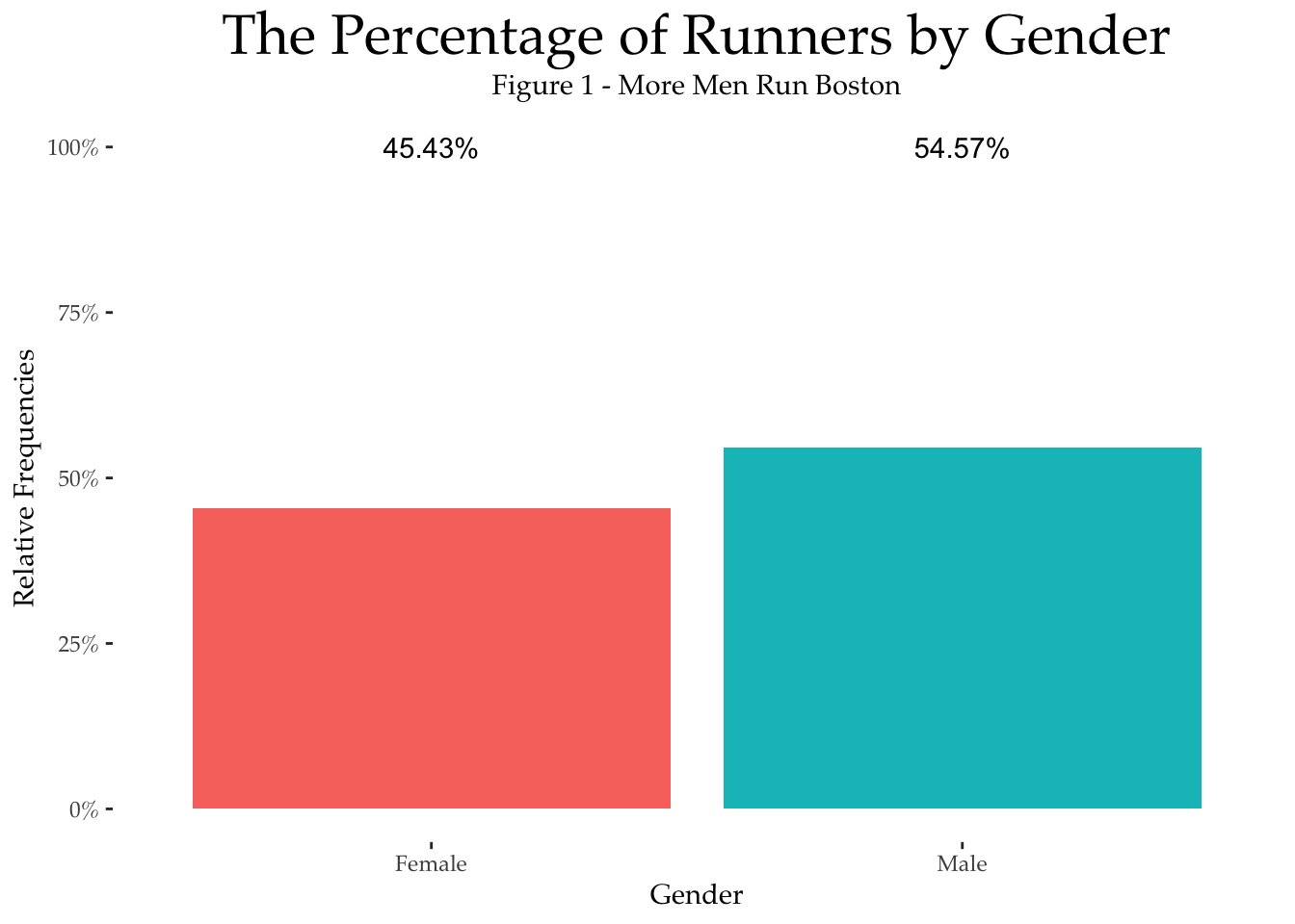
The bar chart, Figure 1, below shows that overall about 45% of Boston runners are female and the line-graph shows that they have an average age of about 40, some 5 years younger than their male counterparts.
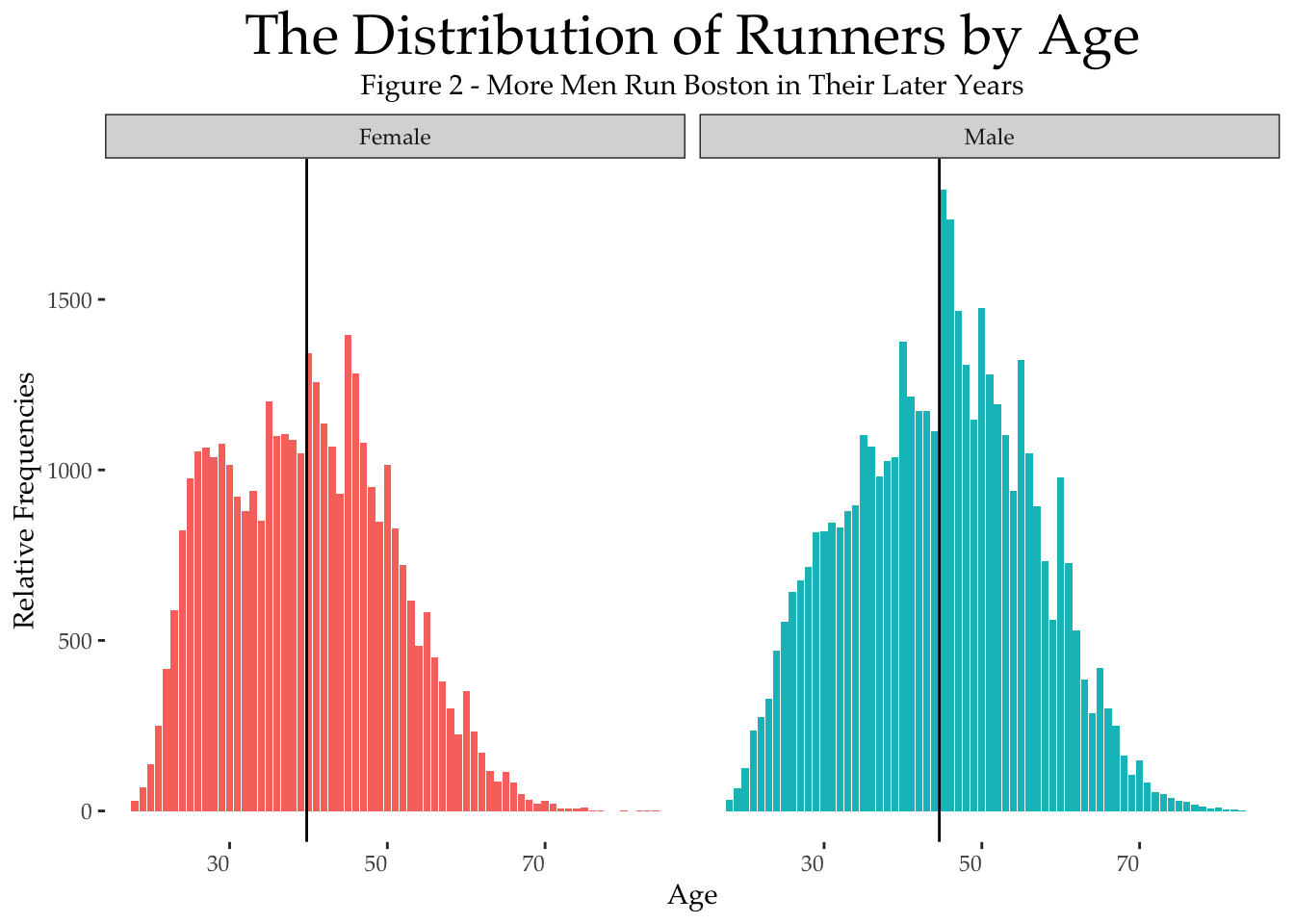
The nice thing about the Boston dataset is that it provides precise age information for each runner, as opposed to the age-ranges that are more usual in marathon datasets. Further detail on the distribution of ages is presented in the histograms in Figure 2, which show the relative proportion of runners of each gender and for different ages. For example, we can see a greater proportion of women between the ages of 20 and 42, compared to men. But, from 42 years on, there are proprtionally more men than women.
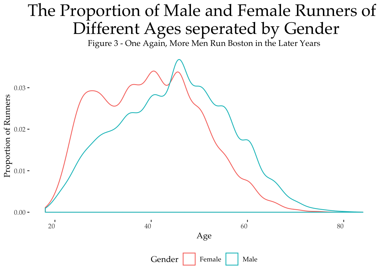
It is interesting to contrast sharp increase in the proportion of females runners from ages 20 to 28, compared to a more gradual increase for men between the ages of 20 and 45. In both cases, after the age of 45, the proportion of runners participating in Boston drops steadily.
Places of Origin
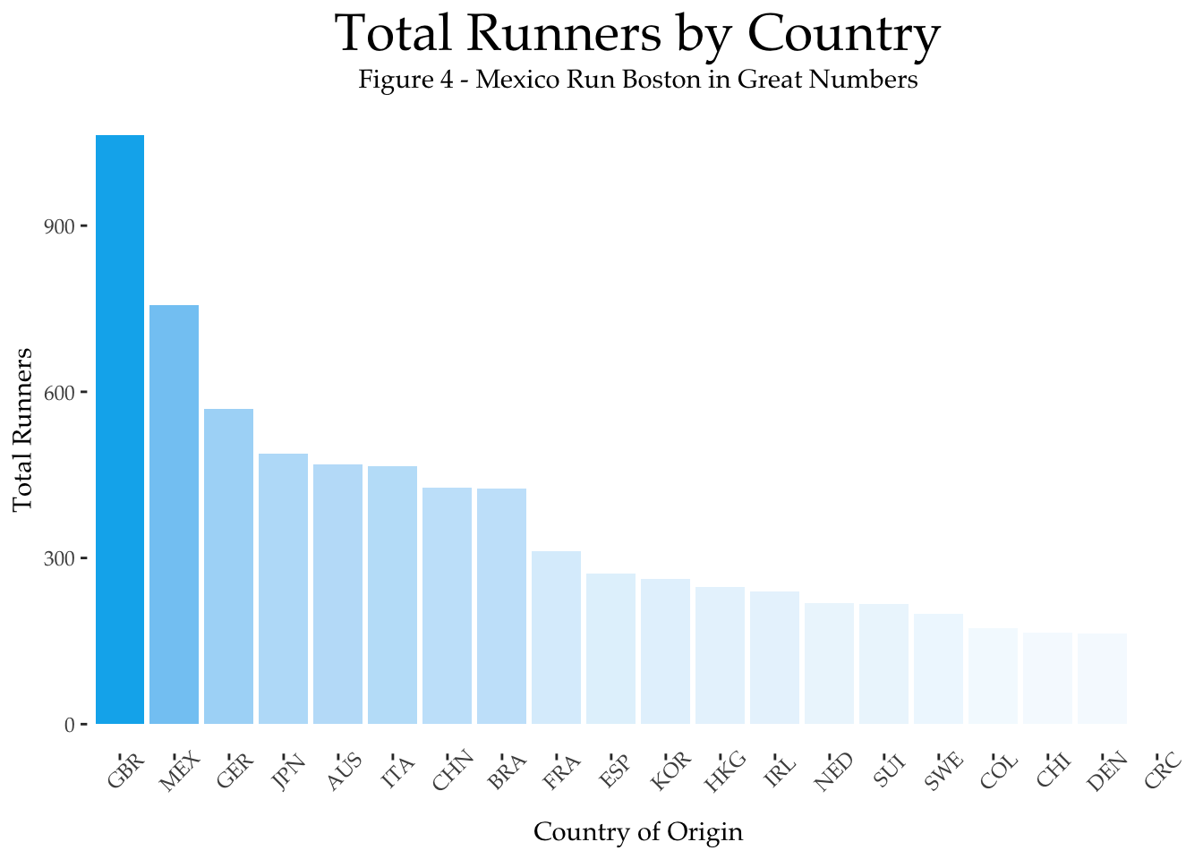
Where do these runners come from? Unsurprisingly, the large majority (over 60,000) come from the USA, and about a fifth of these from Boston’s home state of Massachusetts. Approximately 1,800 runners come from Canada and after that there is a long tail of countries with different levels of partcipation. All in all, these three years Boston attracted runners from 104 different countries around the world.
Let’s take a look at some of these. First, for ease of presentation, we will limit ourselves to countries that have more than 50 runners participating; there are 23 such countries. To avoid the USA and Canada from drowning out the other countries we will exclude both of these from the graphs that follow. The first graph below shows the total number of participants per country for the remaining 21 countries. Great Britain comes out on top, with more than 400 runners, followed by Mexico, Germany, Japan, and Australia.
What about the locals?
Since we left out the USA from the above analysis, let’s now take a look at US participation by state and by city; once again, for ease of presentation we will limit ourselves to the top 20 states and cities and for variety, this time, we will show the number of male and female runners. In the first graph below — participation by state — we see a much higher participation level from Massachusetts along with a healthy showing from California, New York, and Texas. Similarly, Boston and Cambridge feature strongly in the next graph — participation by city — with the likes of New York and Chicago, two big marathon cities, also providing plenty of runners.
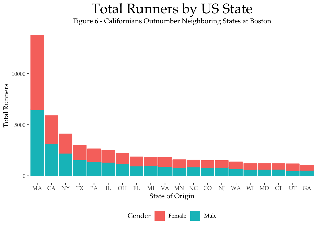
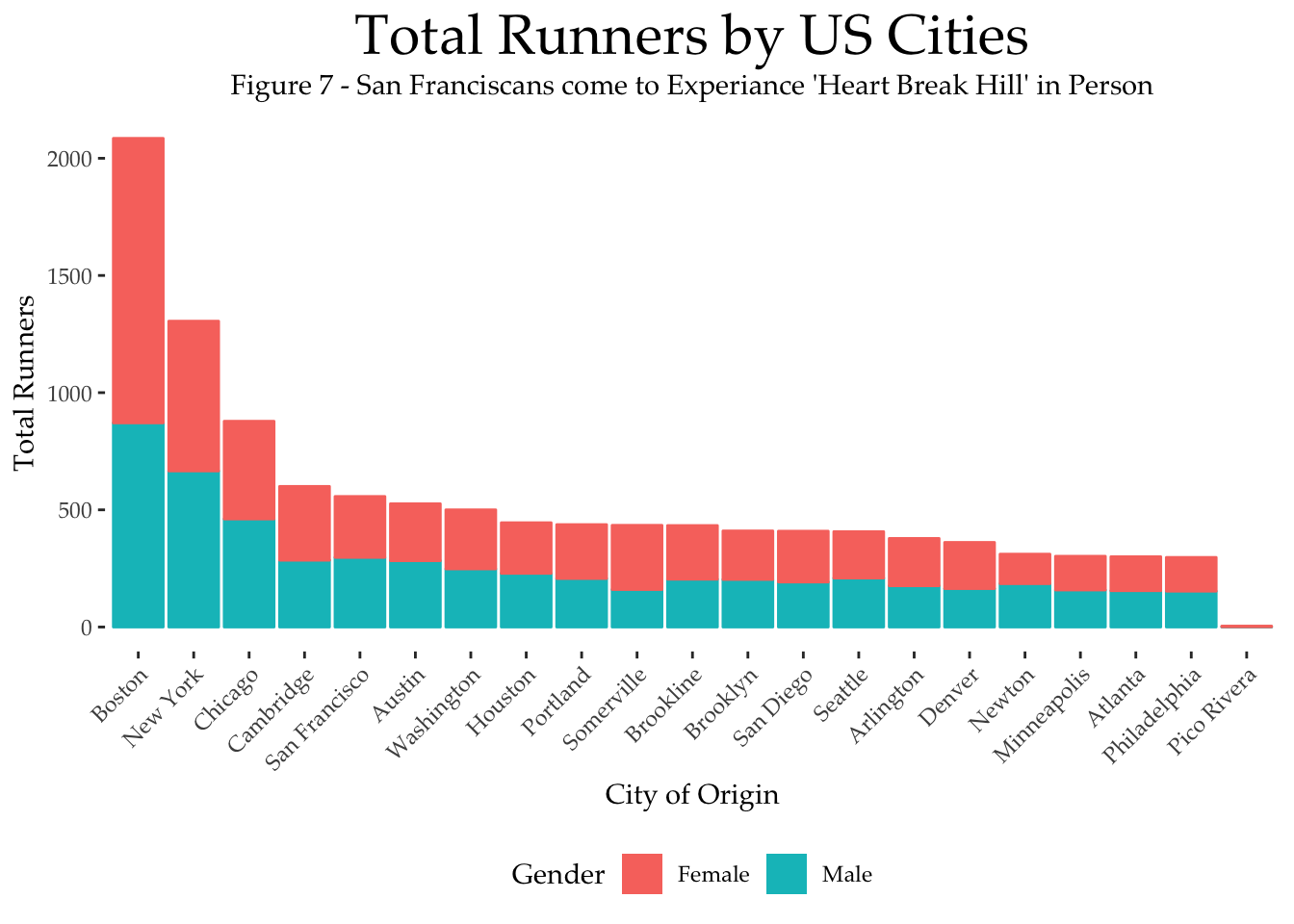
It may be worth noting that while most states and cities provide more men that women to run Boston, Boston itself, and Massachusetts, provide more female runners than males. I’ve added my hometown of Pico Rivera to soley represent.
Marathon Performance
The Fastest Countries and States
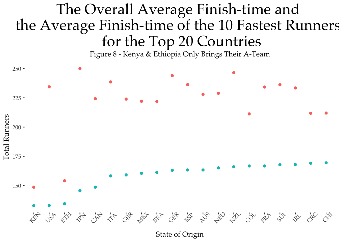
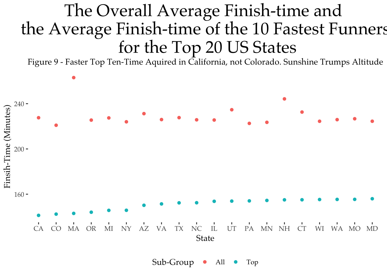
Again just for fun, let’s return to the country and states of origin of our Boston runners and try to determine those countries and states with the fastest runners; once again we will limit ourselves to the countries and states used above.
To keep things simple — but not too simple — we will consider two different ways to answer this question. The first way is to compute the average finish-time for all runners from a particular country or state. This is effectively the finish-time of the typical runner from that country or state, and may favour countries and states with fewer participants, as these participants may be more experienced marathoners.
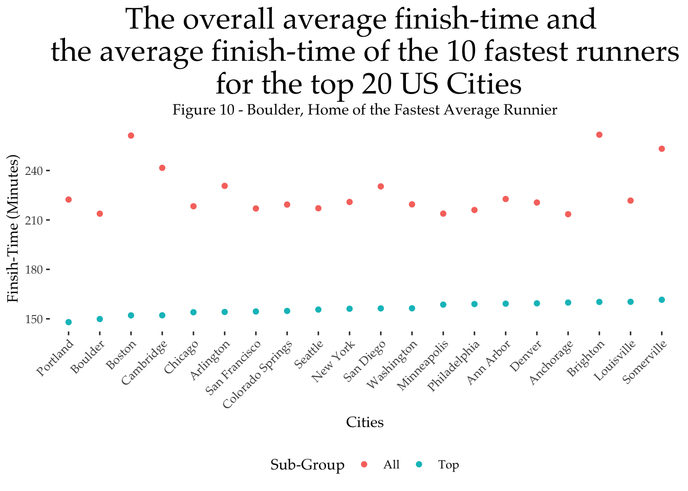
The second way to evaluate how fast the runners from a given country or state are, is to focus on the fastest finishers — we will look at the top-10 finishers from each country and state — and report their average finish-times. The results of this for countries and states are presented in the two graphs that follow; in both the countries and states are ordered based on the average finish-times of their top-10 fastest runners.
When we focus on the finish-time of all runners, Kenya and Ethopia come out on top of the country rankings, with average finish-times of 148 and 154 minutes, respectively; see Figure 8. This is better than most counties fastest-times averages. But when we look at the average finish-time of the fastest (top-10) runners then the US, Japan, and Canada win out, with finish-times of 133, 145, and 148 minutes, respectively.
Among US states, Colorado, Pennsylvania, and New Mexico come out on top for the average finish-time of all runners with finish-times of 220 minutes for Colorado and 223 minutes for New Mexico. However, the fastest US runners hail from California, Colorado, and Massachusetts with finish-times of 141, 142, and 143 minutes, on average, for their top-10 finishers, respectively.
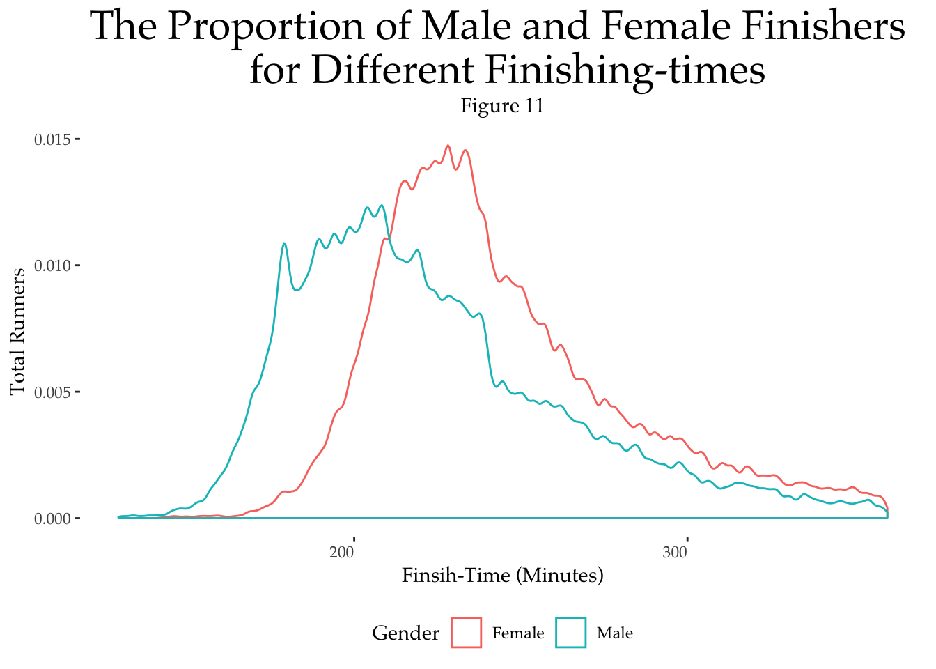
Next, let’s take a look at performance in terms of the finish-times of runners. Men are faster than women on average. For example, in these year event the average finish-time for men was just over 224 minutes compared with 244 minutes for women. The graph below plots the proportion of runners with various finish-times. We can see a greater proportion of male finishers up to the 210 minute mark (3.5 hours), and after this it female runners tend to domainate.
How does performance vary with age?
This gender gap is preserved when we compare finish-times by age; see the Figure 12 below. For both men and women, the fastest runners tend to be in their 30’s, slightly older for women than for men. After this, as we age, our finish-times suffer. Interestingly, the relative difference between men and women reduces with age; the gender gap appears to close.
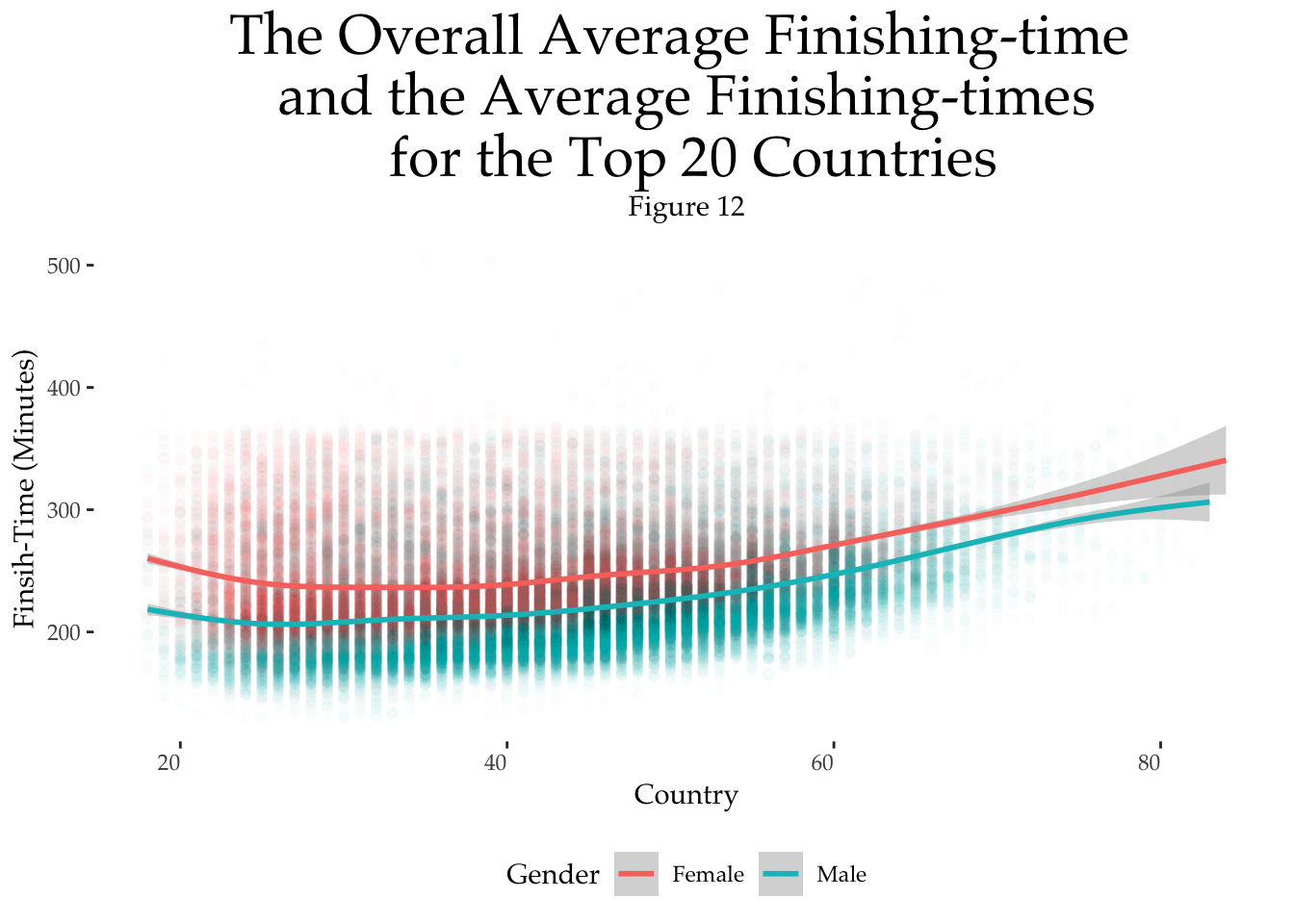
Thus, as we age, the finish-times of men and women tend to become more and more similar. In future analysis we’ll take a closer look at how each gender runs the course, regardless of time.
Conclusions
That’s enough data for now — maybe too much? — or just enough as marathon season takes hold. The aim of this post was to provide a summary of the participants for the Boston Marathon, focusing on gender, age, place of origin, and comparing their participation numbers and finish-times.
That’s just the start of this analysis, however, and in the coming days I plan to look more deeply at the pacing of the Boston Marathon,